- AtlasMoth Newsletter
- Posts
- Grammarly's Paywall UX
Grammarly's Paywall UX
Get 100k+ new paid users with simple hack

In partnership with
Training cutting edge AI? Unlock the data advantage today.
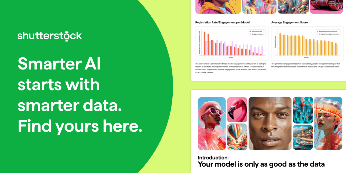
If you’re building or fine-tuning generative AI models, this guide is your shortcut to smarter AI model training. Learn how Shutterstock’s multimodal datasets—grounded in measurable user behavior—can help you reduce legal risk, boost creative diversity, and improve model reliability.
Inside, you’ll uncover why scraped data and aesthetic proxies often fall short—and how to use clustering methods and semantic evaluation to refine your dataset and your outputs. Designed for AI leaders, product teams, and ML engineers, this guide walks through how to identify refinement-worthy data, align with generative preferences, and validate progress with confidence.
Whether you're optimizing alignment, output quality, or time-to-value, this playbook gives you a data advantage. Download the guide and train your models with data built for performance.
Hey, it’s Kushagra. Welcome to this week’s AtlasMoth drop.
This week, we’re looking at how Shane Fontane and the Grammarly crew pulled off a wild flip: turning a paywall from a lock into a gift.
A small shift made users feel Premium, driving a 20% revenue increase and over 100,000 upgrades.
It’s proof that good UX isn’t about tricks. It’s about trust.
Let’s crack how a small reframe turned walls into wins.
💬 Building for people beyond borders? Book a call to explore more
Shane Fontane has spent 10 years in the game, creating apps that grow and continue to win trust. At Grammarly, he ran design for how folks sign up, stick, and pay.
One play? A small 5-step shift in the pay wall. From lock ➝ gift. That flip? Brought in 20% more cash from upgrades + 100k+ new paid peeps.
Vibing While DesigningThis track gave me a serious boost—check out ‘Particles’ by Tony Anderson🎵 |  |
1. Tease First, Pay Next
The play was simple: give free users a little taste of premium AI tips, right in the moment they were writing.
A quick “here’s how you can sound sharper” or “try this polished version.” Then blur. The rest of the tips faded out.
It wasn’t shoved in their inbox or shown in a banner ad. It happened inside their actual workflow. They were in the zone, using the product, when suddenly they saw what they could have. That small preview felt like value, not spam.
By the time the wall appeared, users already wanted more. This “try before you buy” flow built trust and craving.

2. Game Brain Mode
Shane’s team didn’t just wing it. They brought in Naavik, the folks who study games for a living. Why? Because games are masters at keeping people hooked with levels, quests, and rewards.
Inspired, the team tested a “Locked UI” design with little icons. The idea was to spark curiosity: “Ooh, what’s behind the lock?” But reality hit different.
Users didn’t see mystery; they saw rejection. Instead of intrigue, it felt like a closed door. And when people feel blocked, they bounce. Feedback was loud: walls don’t vibe.
Choose the Right AI Tools
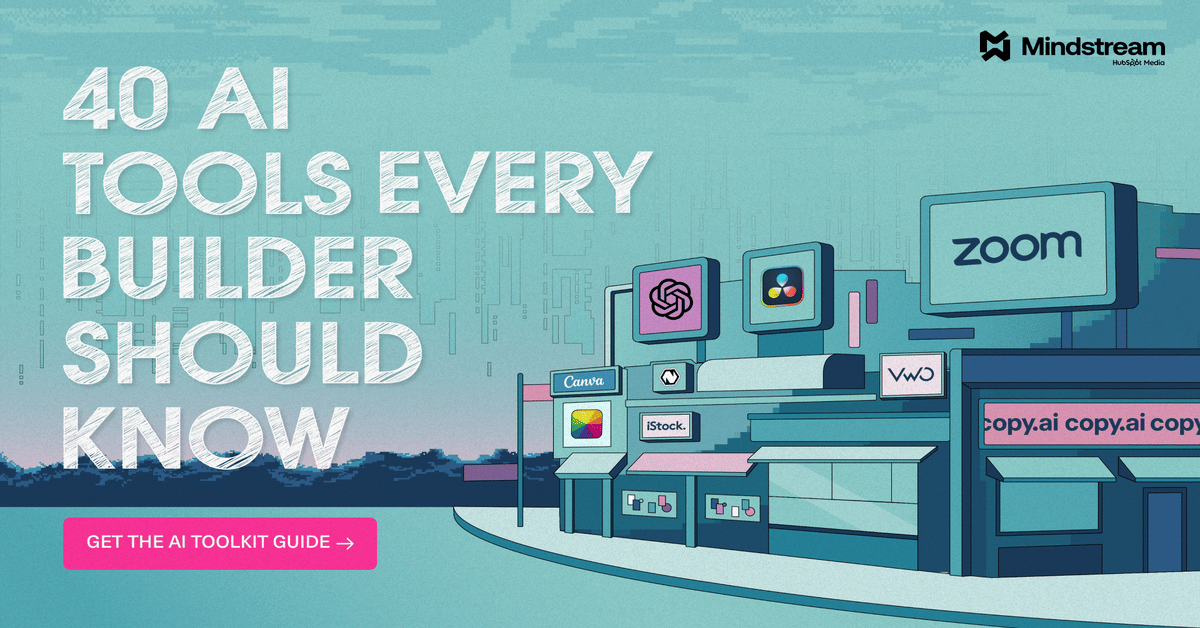
With thousands of AI tools available, how do you know which ones are worth your money? Subscribe to Mindstream and get our expert guide comparing 40+ popular AI tools. Discover which free options rival paid versions and when upgrading is essential. Stop overspending on tools you don't need and find the perfect AI stack for your workflow.
3. From Lock ➝ Gift
Instead of “no, you can’t,” the team flipped the script. Enter: the sticker peel. Imagine a tip covered with a peelable layer—you swipe, and boom, you get a sneak peek. It felt fun, tactile, almost like opening a surprise.
At first, this worked. Engagement went up. But then came the backlash. Users started feeling strung along—like they were being teased without real payoff. The experience felt gimmicky. Uninstalls spiked. Daily activities dipped.
That’s when Shane made the call: “No more scarcity tricks. Let’s go share, not scare.” Instead of hiding tips, they gave them away freely. But here’s the twist—they framed it as a gift: “This one’s yours. Want more?” That tiny shift in tone changed everything.

4. Hype Loops, Not Walls
Two behavioral science tricks powered the next breakthrough:
Frame Effect → The same message lands differently depending on how you frame it. Saying “You’re locked out” feels harsh. Saying “You’ve got this, here’s more” feels generous. Users leaned into the second.
Endowment Effect → People value things more once they feel they’re already theirs. By giving free tips upfront, users felt they owned a slice of Premium. So upgrading didn’t feel like buying; it felt like unlocking the rest of what was already theirs.
That combination flipped frustration into motivation. Result? +22% upgrades and +4% annual plan purchases.
With KeepCart or Without It — See the Margin Difference

Every checkout leak costs you. KeepCart shows exactly how coupon extensions quietly shrink your revenue — and how blocking them can recover hundreds per order. Your profit margin deserves a before-and-after moment.
Top brands like Bucketlisters and Quince have already seen the difference.
5. Play Clean, Win Long
At first, the team leaned into loss aversion classic “you’re cut off, pay now” messaging. And sure, it pushed a few upgrades, but the downside was bigger. People felt tricked. Trust eroded. Long-term usage dipped.
So they pivoted. Instead of scaring users with scarcity, they went clean: show value openly, explain what Premium adds, and let people decide.
This clarity built trust. And trust stacks over time, leading not just to short spikes in revenue, but sustainable growth.
30 Minutes Can Save YouGreat design doesn’t happen alone. One session can save you 10+ design iterations later. |  |
The Big Take
Pay walls don’t need to feel like traps. With the right frame, they can feel like gifts.
At Grammarly, the “gift > gate” flip turned users into fans and buyers.
So next time you set up an upgrade screen, ask:
What if this wall were a gift?
And how would you wrap it so folks want to rip it open?
When design feels natural, innovation becomes invisible. |  |
Reply