- AtlasMoth Newsletter
- Posts
- Issue 21: How We Increased Sign-Ups by 20% Without Lowering Prices
Issue 21: How We Increased Sign-Ups by 20% Without Lowering Prices
PLUS: Critique of Survive Into Night

In partnership with
Free THCA Pre-rolls Shipped Right to Your Door

No med card required! Moonwlkr is sending out THCA pre-rolls, shipped directly to your door!
THCA is the chemical precursor to THC. When heated, it delivers all the same effects as traditional cannabis.
See for yourself! The next 300 people can try them for no charge.
🌟Hey, it's Kushagra. Welcome to AtlasMoth's “FOCUS” edition.
🏖️As I soak up the sun at the beach, I've had time to reflect on my journey over the past few months. I've decided to zero in on helping product founders and managers elevate their user experience (UX).
Why the shift? Working with various clients, I've seen how exceptional design directly leads to stellar user experiences, boosting retention rates, Customer Lifetime Value (CLV), and generating rave testimonials—essential elements in our field.
🎮In this and future editions, we'll dive deep into the cases and theories of gamification and UX design, equipping product leaders with the tools to hit their targets.
Harnessing the Framing Effect in Design
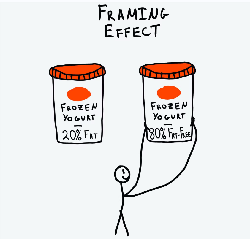
🧠The framing effect is a cognitive bias where people's decisions are influenced by the way information is presented. It highlights the importance of context and presentation in shaping perceptions and choices.
🌟By leveraging this effect, we can create designs that guide users towards desired actions and enhance their overall experience.
📊If you like numbers, learn to test designs
One of my client Story…
My team was on a mission to enhance their subscription plans. Despite offering a valuable service at $100 per year, sign-ups were not meeting expectations.
We decided to put our love for numbers to the test.
We needed to make their subscription offer more appealing without changing the core product or its price. The solution lay in how we framed the offer.
We ran an A/B test.
One group of users saw the original message: "Pay $100/year." The other group saw a rephrased offer: "Save 20% annually." Everything else on the page remained the same to ensure a fair test.
The results were clear: the "Save 20% annually" message significantly boosted sign-ups. By focusing on the savings rather than the cost, we made the offer more attractive and easier to commit to.
This experiment underscored the importance of testing and data-driven decision-making. A simple change in wording, backed by numbers, can greatly enhance user experience and drive better outcomes.
By embracing the power of numbers and testing, we not only improved our subscription sign-ups but also gained valuable insights into user behavior.
💸Benefit: Presenting a subscription as “Save 20% annually” instead of “Pay $100/year” increases sign-ups.
🔍Testing: Use A/B testing to measure conversion rates for different framings.
🛠️If you like planning, create design systems
UI Elements: Language, visual hierarchy, contextual information
What we can offer….
Client’s pricing page needed a revamp to improve user engagement and conversions.
We replaced "Don't miss out" with "Gain access" to create a more positive, benefit-focused tone. This small change made our offers sound more appealing and welcoming.
To guide users, we highlighted the most advantageous subscription option using larger fonts and a standout color. This made the best choice immediately visible and attractive.
We added brief explanations next to each plan, clarifying the benefits. Users could easily understand what they were getting, making decisions quicker and easier.
These changes led to a significant increase in sign-ups and user satisfaction. By focusing on positive language, effective visual hierarchy, and clear contextual information, we enhanced our user experience and achieved our goals.
🌈Language and Tone: Positive framing (e.g., "You save 20%") often leads to better outcomes than negative framing (e.g., "You lose 20%").
🎨Visual Hierarchy: Highlighting options through size, color, or placement can direct user attention and influence choices.
📖Contextual Information: Providing relevant context around choices helps users understand the implications of their decisions.
🛒If you like seeing results, make checkout, sign-up pages better
Implementation:
🎯Define Objectives: Clearly outline goals like increasing sign-ups or improving feature adoption.
💬Craft Messaging: Use positive language to highlight benefits (e.g., "Unlock premium features for $10/month" vs. "Pay $10/month").
🎨Design for Clarity: Make options visually distinct with contrasting colors, bold text, or icons.
🔍Test and Iterate: Continuously test framings with A/B testing to find what works best.
Gamification Elements:
📊Progress Bars: Visualize progress towards goals.
🏅Rewards and Badges: Highlight benefits of actions.
🏆Challenges and Quests: Frame tasks as rewarding challenges.
🥇Leaderboard and Social Proof: Motivate through competition and social validation.
🌟Applying the framing effect makes interactions smoother and more intuitive. Highlighting positive outcomes and reducing cognitive load boosts user confidence, satisfaction, and leads to a more enjoyable experience, fostering loyalty and positive word-of-mouth.
🚀Integrating these gamification elements leverages the framing effect, making the user experience more dynamic and enjoyable. This strategic combination boosts user engagement, satisfaction, and loyalty.
Discover More!!!
Reach your career goals 🏆
Looking to climb the career ladder? CareerAddict has you covered with a 5-step guide to career planning. With tips and tricks on advancing your career, plus templates to jot down your bright ideas!

Career Addict
Get the free guide → Grab the 5-Step Career Planner
Things I found amazing this week
🕹️The Booming Global Gamification Market
🎮Exploring the Game Design Choices in Survive Into Night
🎵Hit that gave me a kick Listen to Seven Nation Army
Meme of the week
Reply