- AtlasMoth Newsletter
- Posts
- Issue 25: 3 Product Growth Rules I Messed Up So You Don’t Have To
Issue 25: 3 Product Growth Rules I Messed Up So You Don’t Have To
What Amazon, LinkedIn, and Netflix Do for Growth That Others Don't

In partnership with
I WANT YOU TO WIN CASH

Ready to win cash daily? Download INMO and join the fun! Play in exciting challenges by posting an original video, sourced video or vote for your favorite. Whether you’re showing off your skills or supporting the best, you’ve got a shot at winning cash every day. And yes, it really works! Start owning your content or voting for your favorite — download, play and start earning!
Yo, it's Kushagra! Welcome to the AtlasMoth’s 'Growth: 2' series 🦋
Nothing gets a team more hyped than watching their product blow up—more users, higher retention, and that sweet revenue boost 💸
Let’s get real—numbers are everything. Whether it’s leveling up your app’s virality or tracking those key analytics, the data doesn’t lie.
In this edition, I’m breaking down three straightforward techniques to help design teams for growth. Let’s get those numbers up!
Can Your Design Speak in 5 Seconds?
😫Problem: You’ve put in the work on your design, but if users don’t get it in 5 seconds, all that effort is a waste.
I’ve been there, staring at a design I’ve spent hours perfecting, only to realize that what’s crystal clear to me might be completely missed by someone seeing it for the first time. It’s frustrating, but it’s a reality in the fast-paced world of user experience.
⏲️Why It Matters: The 5-second test is your best friend. Flash your design to users for 5 seconds, then ask what stuck with them. If they can’t nail your main value proposition, it’s back to the drawing board time.
🤯I remember the first time I tried this. I thought my design was flawless, but when I tested it, the feedback was eye-opening. What seemed obvious to me was lost in translation, and I quickly realized that simplicity and clarity are key.
🔍Example: Think Amazon. In seconds, you know it’s all about fast and easy shopping. They didn’t just luck out—they tested until 80% of people could recall their value prop instantly.
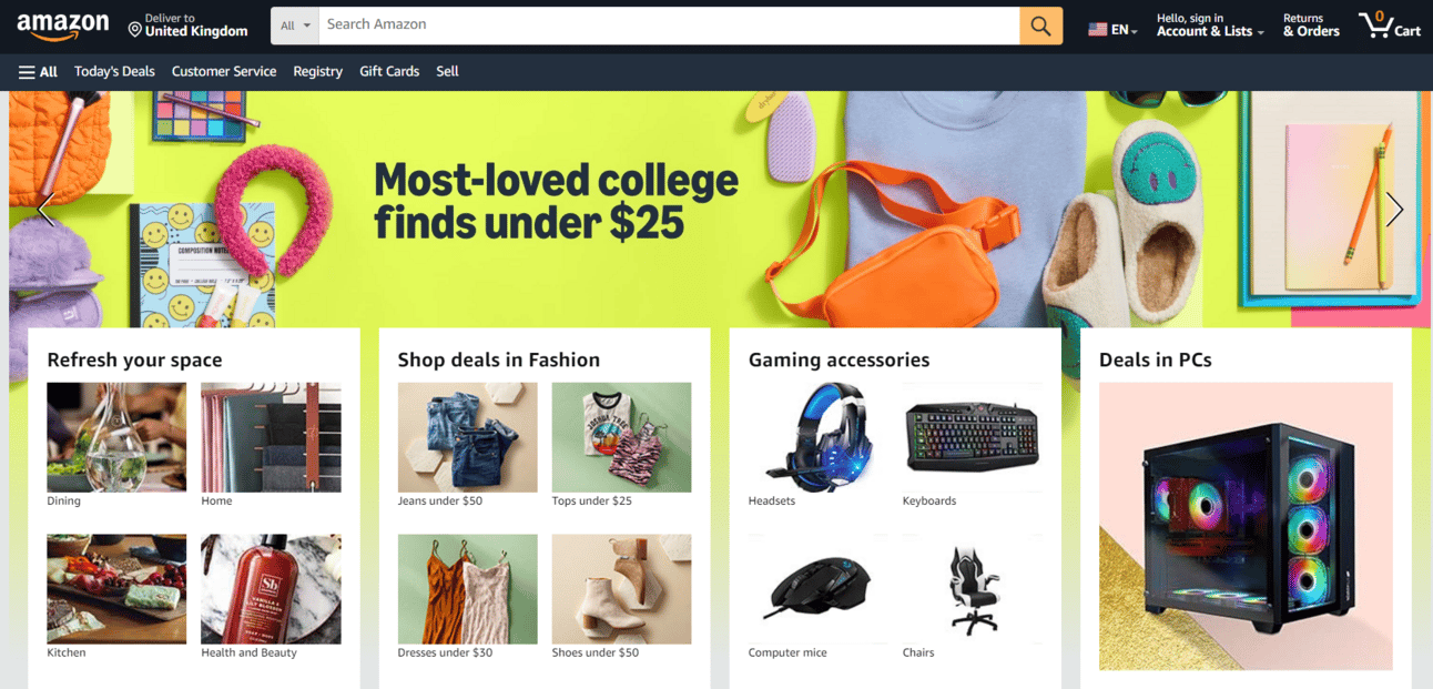
Amazon’s Linear User Journey
This didn’t happen overnight for them, and it won’t for us either. It’s a process of refining and rethinking until that message hits home in just a few seconds. That’s when you know you’ve got something that truly resonates.
Glow Up: Once your design passes the 5-second test, expect to see those engagement numbers climb. Remember, if they don’t get it in 5 seconds, they’re not sticking around for 5 minutes.
Time vs. Impact: Are You Measuring What Really Matters?
⏱️Problem: Some teams get caught up in how long users are in the app, but that’s not the whole story.
🤔I’ve fallen into this trap myself, thinking that if users are spending more time in the app, it’s a sign of success. But over time, I’ve realized that it’s not just about keeping them there—it’s about what they’re actually doing while they’re there.
✅Why It Matters: Track actions that matter—like how many tasks they complete, not just the features they click. This shows how deeply they’re vibing with your product.
😓I learned this the hard way when I noticed users spending time on certain features but not actually getting the results they needed. It was a wake-up call that engagement isn’t just about activity; it’s about meaningful outcomes.
🌐Example: Look at LinkedIn. They don’t just care about how long you’re online—they’re watching how many connections you’re making and the content you’re digging into. It’s about building real, meaningful connections, not just scrolling.

LinkedIn Value Creation
LinkedIn’s approach is a great reminder that real value comes from what users take away from your app, not just the time they spend in it. It’s about fostering interactions that matter, which ultimately lead to a more impactful user experience.
Glow Up: When you focus on depth, not just time, you’ll see more valuable user interactions. Not all clicks are created equal, so make sure you’re tracking what really matters.
Is Your App All Action and No Impact? Here’s What Really Counts
Problem: Most teams stick to basic metrics like clicks and page views, but the real gold lies elsewhere.
🤔I used to focus solely on surface-level metrics, thinking they’d tell me everything I needed to know. But it wasn’t until I dug deeper that I realized how much more insight I could gain from looking beyond the basics.
Initial Value Timeframe: Assess how quickly users can gain value from your product.
Feature Adoption Cohorts: Identify which features encourage repeat usage.
Exit Page Patterns: Analyze where users leave and understand the reasons behind it.
I remember when I first started tracking these deeper metrics. It was eye-opening to see how quickly users could find value and which features they kept returning to. It helped me understand not just if users were engaging, but how and why they were sticking around—or not. 📈
🚀These companies get it right by focusing on what really matters to users. By analyzing these nuanced metrics, they’re able to enhance user experience and keep people coming back. It’s a reminder that the most valuable insights often come from looking beyond the surface.

Netflix: ‘Your Next Watch’ Feature
📈Glow Up: Numbers don’t lie, but only if you’re looking at the right ones. Focus on these three, and you’ll see what’s really working, helping you make moves that drive growth.
🧩If you remember one thing from today, let it be this: Design with purpose. Whether it’s nailing your value proposition in 5 seconds, tracking the right engagement, or focusing on the metrics that matter, every detail counts.
5 Steps to Your Destination:
Define Your Core Message: Clearly identify what you want users to understand instantly.
Simplify Your Design: Remove clutter and focus on clear, essential elements.
Conduct Initial Tests: Show your design to users for 5 seconds and see what they remember.
Iterate Based on Feedback: Adjust your design based on user feedback to improve clarity.
Re-Test and Refine: Continuously test and refine until your message is clear in 5 seconds.
✨When you design by numbers, you’re not just making a product—you’re crafting an experience that people won’t want to put down.
I could keep going with my design examples, but you get the point. Need a design partner to bring your vision to life? Book a session and let's make it happen!
What I found amazing this week
Instagram Launches 'Song on Profile' Feature, Reviving Myspace Vibes🌐
This track gave me a serious boost—check out ‘The End Has No End’ by The Strokes and see why it hit me so hard!🎵
Secrets to Thriving in the Indian Gaming Revolution with Industry Titans🎮

Meme of the week
Reply