- AtlasMoth Newsletter
- Posts
- Mayhem of UX Case Studies
Mayhem of UX Case Studies
Showcasing of Portfolio

In partnership with
Learn Business Buying & Scaling In 3 Days

NOVEMBER 2-4 | AUSTIN, TX
“Almost no one in the history of the Forbes list has gotten there with a salary. You get rich by owning things.” –Sam Altman
At Main Street Over Wall Street 2025, you’ll learn the exact playbook we’ve used to help thousands of “normal” people find, fund, negotiate, and buy profitable businesses that cash flow.
Tactical business buying training and clarity
Relationships with business owners, investors, and skilled operators
Billionaire mental frameworks for unlocking capital and taking calculated risk
The best event parties you’ve ever been to
Use code BHP500 to save $500 on your ticket today (this event WILL sell out).
Click here to get your ticket, see the speaker list, schedule, and more.
Hey, it’s Kushagra. Welcome to this week’s AtlasMoth drop.
Case studies have become the gold standard of UX portfolios.
They’re now the ultimate proof of skill, the format every recruiter expects, the artifact every designer builds.
It’s wild to think how far we’ve come from the days of pixel-perfect dribbble shots to story-driven design narratives.
But here’s the paradox: most of these case studies, beautifully formatted and impressively detailed, are strangely un-UX.
They fail not by omission, but by overexplanation.
They perform UX instead of practicing it.
💬 Building for people beyond borders? Book a call to explore more
Vibing While DesigningThis track gave me a serious boost—check out ‘Lichtung’ by Dinik Eulberg🎵 |  |
The Paradox of the “Complete” Case Study
Open a few designer portfolios and you’ll see the pattern.
Long, polished, structured.
Every step in place research, personas, journey maps, ideation, and testing.
Everything looks right.
And that’s exactly the problem.
It looks right.
It’s storytelling, not design. And storytelling isn’t bad, it’s just not the same thing.
Because in real life?
We don’t follow every UX step like a checklist.
We move in fragments, micro-problems, quick fixes, and small validations.
That’s how real products evolve.

A simple red badge
A Quick Example
On a recent project, users weren’t completing their account setup.
It hit business numbers hard.
We didn’t run a full discovery or deep research sprint.
We just added a red badge, a simple notification dot that told users, “something needs your attention.”
It worked.
Why? Because it tapped into a familiar mental model, one that bridges Norman’s Gulfs of Execution and Evaluation.
If it didn’t work, then we’d test or survey.
But we didn’t need to decorate the solution with personas or journey maps.
It was small, honest, and effective.
The Problem with Long Case Studies
We’re wired to think: long = deep.
Lots of deliverables = thoughtful designer.
But most of the time, what impresses us isn’t the solution, it’s the presentation of rigor.
The illusion of complexity becomes the proof of skill.
That’s not UX.
That’s theater.
Traditional UI patterns
Experience Cognitive Amplification
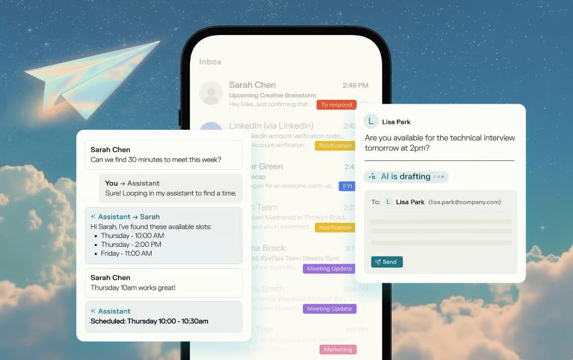
Join Pressmaster.ai on October 15 for The Worlds First AI Built for Cognitive Amplification.
See how your ideas can turn into influence through authentic communication powered by your own thinking patterns.
Reserve your free spot today and experience what amplified intelligence feels like.
Showcase to Please
Designers build case studies to please.
To fit what recruiters expect.
To look “impressive.”
But let’s be real, “impressive” isn’t a UX metric.
Clarity is.
Confidence is.
Ease is.
A good experience is invisible.
You don’t notice it, you just move.
So why should our case studies be the opposite, loud, long, and overdesigned?

What 100K+ Engineers Read to Stay Ahead

Your GitHub stars won't save you if you're behind on tech trends.
That's why over 100K engineers read The Code to spot what's coming next.
Get curated tech news, tools, and insights twice a week
Learn about emerging trends you can leverage at work in just 10 mins
Become the engineer who always knows what's next
Designing Case Studies as True UX Experiences
A short, honest case study about a small but meaningful fix speaks louder than a bloated one filled with process porn.
But its risky brevity is often mistaken for shallowness.
And yet, that brevity often signals maturity.
I’ve heard from countless recruiters who say:
“Our designers insist on running the full UX playbook for every task, even when we just need a tweak.”
And ironically, those same teams look for long, detailed case studies when hiring.
They reward what they don’t actually want.
30 Minutes Can Save YouGreat design doesn’t happen alone. One session can save you 10+ design iterations later. |  |
So before polishing your next case study, ask yourself:
Would Steve Krug have to think?
Because in the end, clarity isn’t the absence of depth, it’s what reveals it.
TL;DR - UX Case Studies, Reimagined
✅ Make them clear, not complex.
✅ Make them concise, not performative.
✅ Make them self-explanatory, not decorated.
A great case study shouldn’t impress; it should click.
Design it like no one’s watching, test it like everyone is. |  |
Reply