- AtlasMoth Newsletter
- Posts
- Product In 5 Seconds
Product In 5 Seconds
From Onboarding to Simplified Search

In partnership with
Turn AI Into Your Income Stream
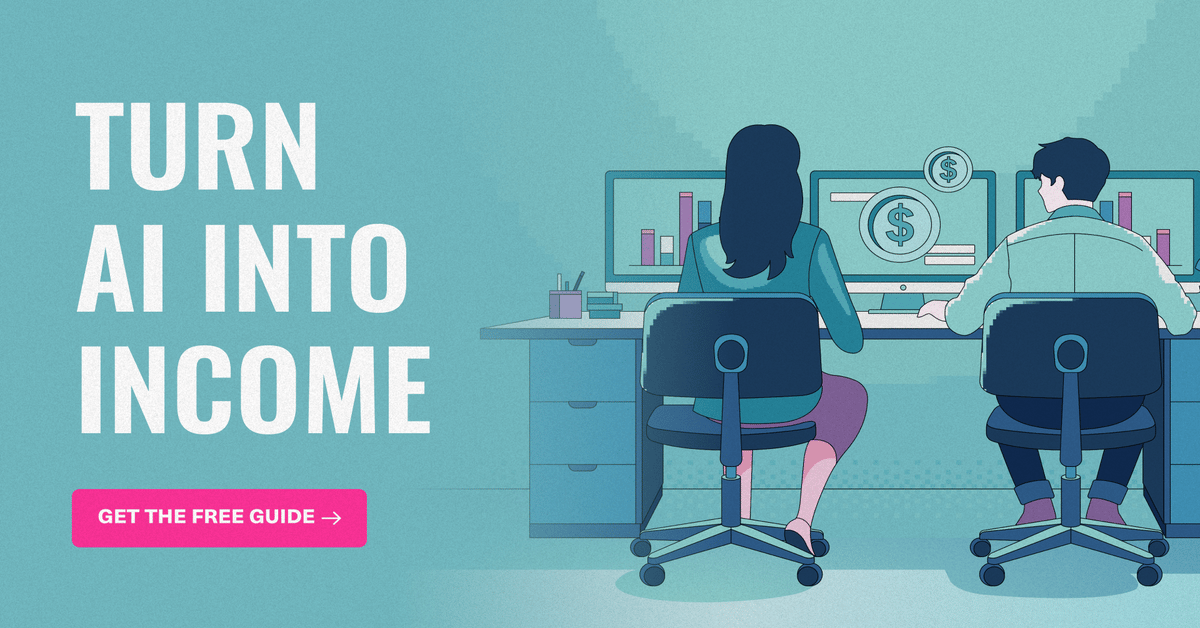
The AI economy is booming, and smart entrepreneurs are already profiting. Subscribe to Mindstream and get instant access to 200+ proven strategies to monetize AI tools like ChatGPT, Midjourney, and more. From content creation to automation services, discover actionable ways to build your AI-powered income. No coding required, just practical strategies that work.
Hey, it’s Kushagra. Welcome to this week’s AtlasMoth drop.
Let’s be real for a second.
Most users give your product five seconds.
That’s it.
If they can’t figure out what your product does or what to do next, they’re gone.
No scroll. No click. Just gone.
That’s why every successful product needs to pass one simple test 👇
💬 Building for people beyond borders? Book a call to explore more
Vibing While DesigningThis track gave me a serious boost—check out ‘Dawn’ by Roald Velden 🎵 |  |
The 5-Second Test
You show someone your homepage, landing page, or app screen for five seconds.
Then ask:
🔸“What did you just see?”
🔸“What can you do here?”
That’s it. No hints. No extra time.
Sounds too simple?
That’s exactly why it works.
Why does this test hit hard
People don’t read websites.
They glance at them like billboards flying by on a highway.
If your product can’t explain itself in that blink, it’s not simple enough.
When your design passes this test, magic happens:
🔸People stay longer. Clear design builds comfort and confidence.
🔸Conversions go up. When the next step is obvious, users take it.
🔸Your team aligns. You instantly see which parts confuse people and fix them together.
Real-world examples that nailed it
Dropbox – The One-Action Homepage
Dropbox used to overload users with features. Then they stripped it down to one thing: sign up.
After the redesign, conversions jumped. Clarity won.

Dropbox Redesigned Homepage
Slack – Simplified Onboarding
Slack’s early onboarding screens were walls of text. A 5-second test showed users felt overwhelmed.
They switched to short, visual steps, and retention went up fast.

One goal, one page
Airbnb – Focused Search
Airbnb’s search used to hit users with every filter at once. After testing, they cut it down to just the essentials: date, time, and guests.
The result? Higher engagement, more bookings.

Only the filters that matter are date & time
Learn how to make AI work for you
AI won’t take your job, but a person using AI might. That’s why 1,000,000+ professionals read The Rundown AI – the free newsletter that keeps you updated on the latest AI news and teaches you how to use it in just 5 minutes a day.
How to run a 5-Second Test (step-by-step)
1. Pick one page.
Start small: hero, pricing, onboarding, or dashboard.
One test = one page.
2. Define success.
What should people understand in five seconds?
🔸Product purpose
🔸Primary action (Sign up / Search / Book)
🔸Set a goal like “80% of users identify the product and action correctly.”
3. Prepare your visuals.
Take a screenshot or mockup of your page.
If comparing versions, create A/B variants (change one thing at a time).
4. Write your questions.
Keep them short and open:
🔸“What did you just see?”
🔸“What can you do here?”
🔸Optional: “Where would you click first?”
5. Recruit 5–15 testers.
Teammates, friends, or users. Five users surface most issues; 15+ gives better data.
6. Show it for exactly 5 seconds.
No scrolling. No context. Just five seconds.
7. Capture their first thoughts.
Ask your questions immediately and write down answers word-for-word.
8. Categorize results.
Mark:
🔸Correct product description?
🔸Correct action identified?
🔸Notes on confusion or hesitation.
9. Analyze patterns.
Are users missing the CTA?
Is your headline vague?
Is the hero image distracting?
10. Fix the clarity killers.
Focus on high-impact, low-effort changes:
🔸Stronger headline
🔸Fewer elements
🔸Clearer CTA
🔸Cleaner layout
11. Re-test.
Make improvements, then rerun the test.
Repeat until 80–90% of users get it instantly.
12. Validate with clicks.
Once it passes, ask users to perform one task (e.g., “Find where you’d sign up”).
Measure clicks, conversions, and retention to confirm the win.


Most coverage tells you what happened. Fintech Takes is the free newsletter that tells you why it matters. Each week, I break down the trends, deals, and regulatory shifts shaping the industry — minus the spin. Clear analysis, smart context, and a little humor so you actually enjoy reading it.
Pro tips:
🔸Test on real devices - especially mobile first.
🔸Stick to one main CTA per screen.
🔸Use plain language - skip the jargon.
🔸Let visuals support the story, not hijack it.
🔸Keep feature mentions lightweight.
🔸Match your headline and CTA language. (“Start your trial” → “Start Free Trial”).
30 Minutes Can Save YouGreat design doesn’t happen alone. One session can save you 10+ design iterations later. |  |
The takeaway
Great design isn’t about adding more.
It’s about making meaning obvious in five seconds or less.
So here’s your challenge this week:
Pick one page from your product and run a 5-second test.
If people can’t explain what it does, you don’t need more polish.
You need more clarity.
Design isn’t how it looks. It’s how it forgives. |  |
Reply